PACKAGING & ILLUSTRATION
CLASSICO REDESIGN
Classico—a popular Italian pasta sauce brand sold in North America—aims to bring ease to making authentic Italian food at home and using real and fresh ingredients. The objective of this redesign was to take their packaging and reframe it for a completely new target audience, while maintaining their current messaging. The target audience that was assigned was younger and middle-aged couples and families who primarily work in blue collar and service sectors. This group tends to have fairly unpretentious attitudes, meaning that they are likely attracted to the look and feel of value in their purchases, which acted as the basis for the redesign.
The new labels use bright colours to stand out from the competitors on the shelf and simple illustrations to communicate the idea of ease and fresh ingredients in a more approachable way. The refreshed brandmark also reflects this idea of authenticity in a modernized fashion, inspired by traditional Italian logos seen throughout history. Then adding the bowtie pasta detail conveys personality by creating this clever connection to the product being “classic”.

PACKAGING
PACKAGING

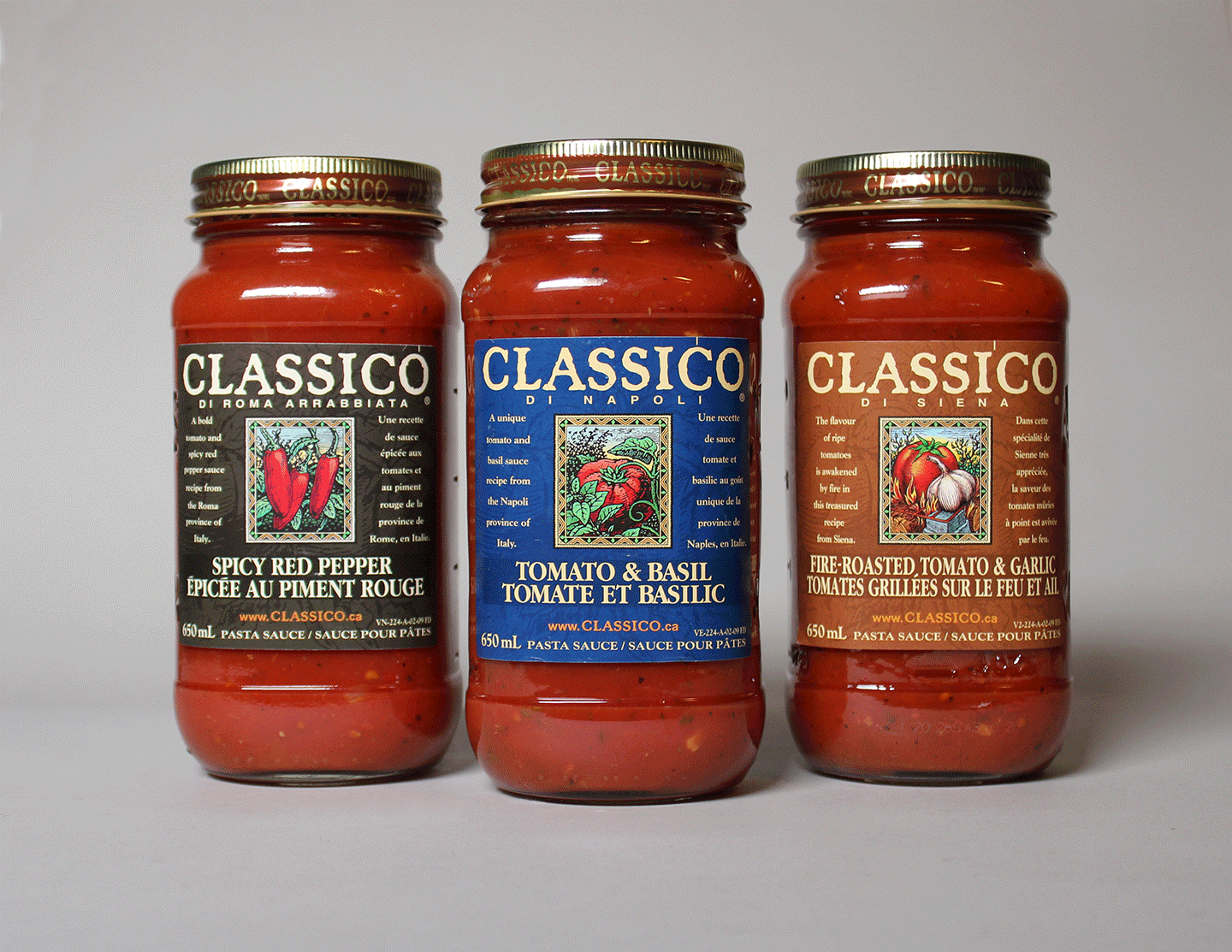
Before

After

Pasta Recommendation
“As the instructor of the Packaging course at the School of Design at GBC for which this redesign was done, I can say how proud I am of your wonderful work and the outcome of the project. These Classico labels are vibrant, compelling and contemporary, standing apart from the sea of pasta sauces on many grocery shelves. And the attention to design detail and nuance helps to make the labels look professional and authentic. Congratulations on a job well done, Nicole!”
— Robin Kachuck, GBC Packaging Instructor
Created while studying at George Brown College in the Packaging Design Course.
All product imagery was photographed by myself.
Date Completed: December 2022
